Today’s Investor
In the fast-moving and hyper-exposed world of investment, Denali chooses a different path—one that is deliberate, selective, and deeply considered. For eight years, they have operated as a venture capital firm in Indonesia, not only providing funding but also offering strategic guidance to support the growth of businesses. Without much publicity, they have built a track record through tangible impact. And now, for the first time, they believe the moment is right to shape a visual identity that truly reflects who they are.
The name “Denali” is taken from the tallest peak in North America—a metaphor that reflects the company’s core principles: standing tall, withstanding pressure, and advancing with strategic composure.
This philosophy became the foundation for the branding approach we developed.

The Turning Point
A New Identity for a New Chapter
Denali had a logo when it was first established, but the design was never actively used. It was considered misaligned with the company’s personality and the character of its founders. The relocation to a new office marked a clear turning point—a new chapter that called for an identity aligned with their direction and values.
The brief was clear. The logo needed to be modern while reflecting the maturity of an established company. It also had to present the company name in a straightforward and unmistakable way. Above all, it needed to convey trust and professionalism. Not something driven by trends, but a timeless identity that would stand the test of time.
Challenge
A Brand Without Documents
The project began with a significant constraint. There were no formal documents outlining the company’s vision and mission, nor was there a public company profile. Even their investment portfolio was not available due to the highly private nature of their business.
We had only one point of entry: observing the founders. Through discovery sessions with the founders, we formed a clear impression of their character. They are individuals with strong presence, decisiveness, and confidence in making strategic business decisions.
They are not afraid to invest in cases that others would avoid, viewing difficult business challenges not as risks but as opportunities worth pursuing. With a solid foundation built on experience, capital, strong networks, and a capable team, they trust in their ability to craft bold strategies and unlock potential through unconventional solutions.
Branding Strategy
The Ruler Meets the Sage
Two brand archetypes were selected to shape Denali’s identity:
- The Ruler, who leads with authority, structure, and control.
- The Sage, who brings clarity and insight through intelligence and logic.
Together, these archetypes shaped a visual and tonal direction that is strong without being aggressive, calm yet sharply focused.
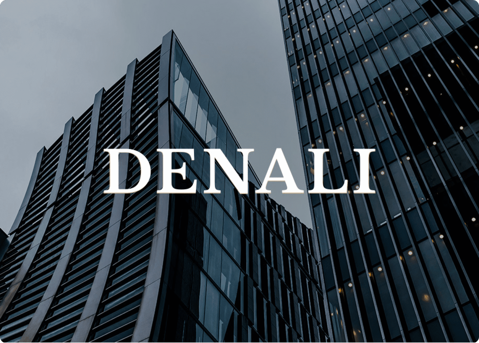
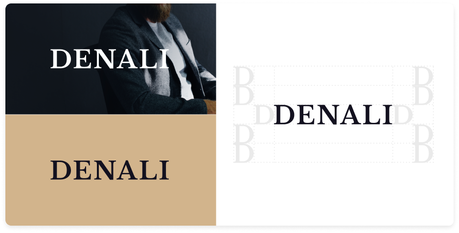
The Logo
Precision Over Noise
Denali’s identity follows a logogram approach—no symbols, no icons, only typography crafted with precision. Inspired by Libre Baskerville, the selected font embodies classic elegance and credibility.
Our team applied a series of subtle customizations to the letterforms, aligning them more closely with the brand’s strategic posture.
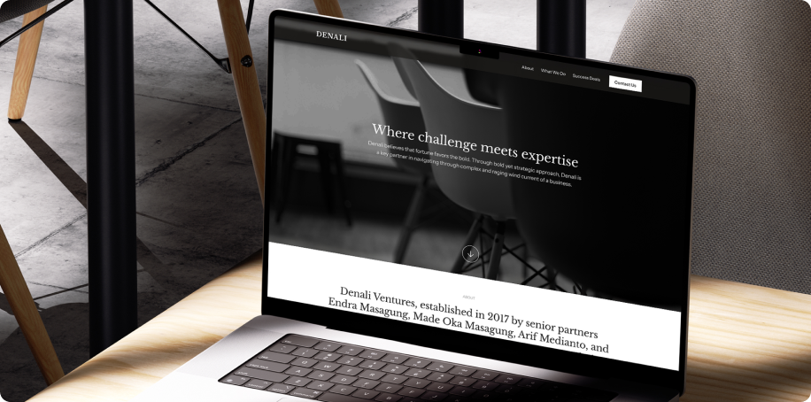
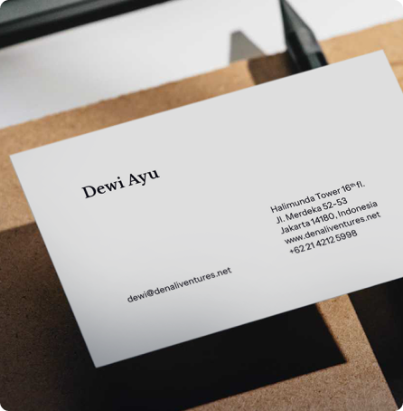
The Result
The project was completed within one month, with the following key deliverables:
- Logo
- Brand guideline
- Letterhead
- Business card
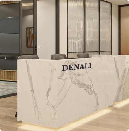
Shortly after the logo was approved, the client requested our input on how the logo should be applied in their new office interior design, including recommendations for the ideal logo sizing in the front office area.
To Stellaris1, this was a meaningful signal that the visual identity we crafted was not only accepted, but ready to be embedded into the physical environment and culture of the company.


The Team
Rilies Kelviana
Project Manager
Khoirunnisa Fatmawati
Graphic Designer
Handoko Lun
Senior Copywriter