



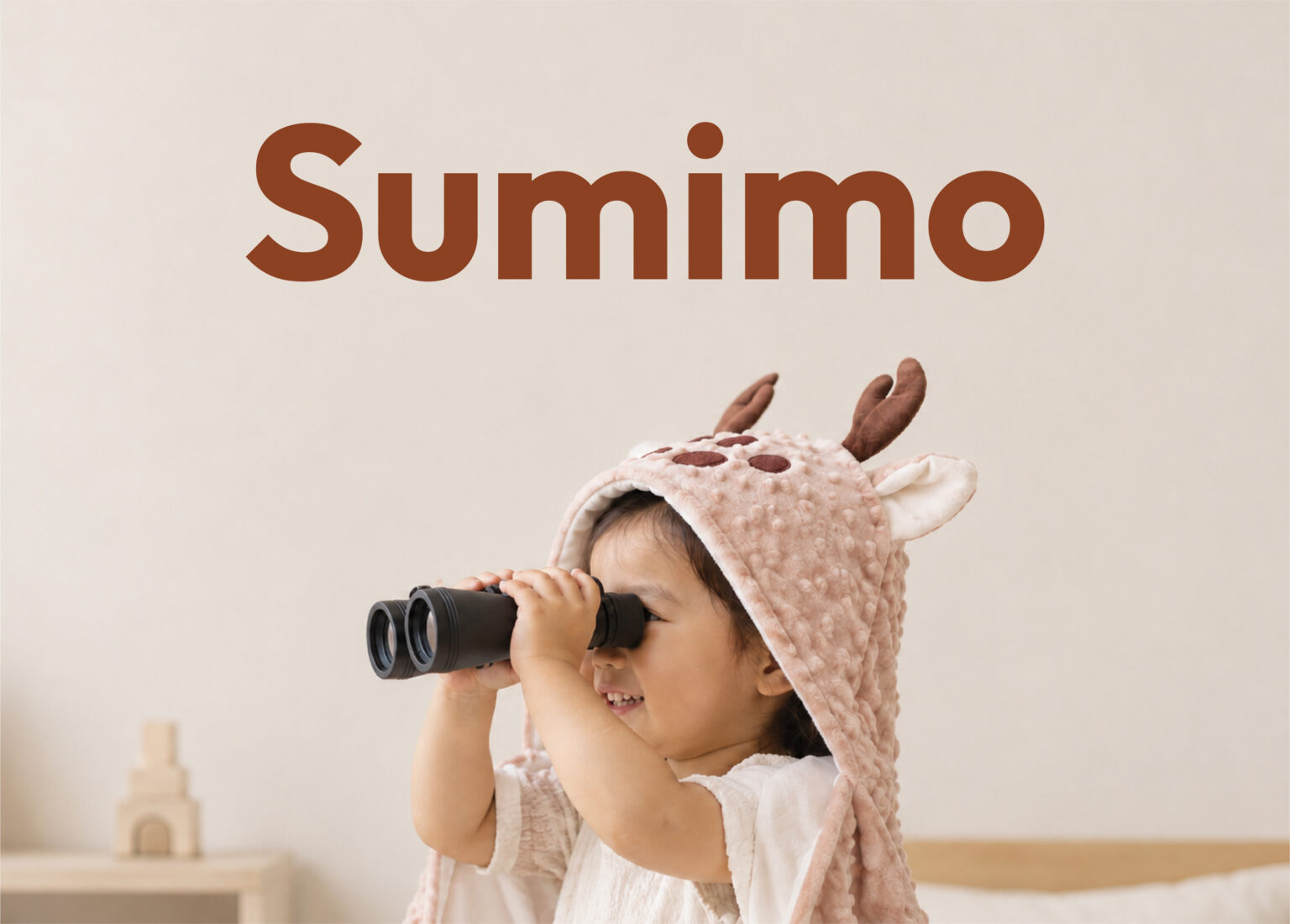
Challenge
For 14 years, Sumimo had built its presence as a trusted local baby products brand, with an identity centered around cute animal characters.
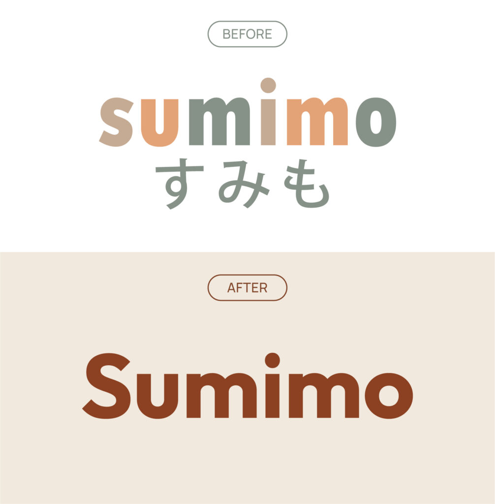
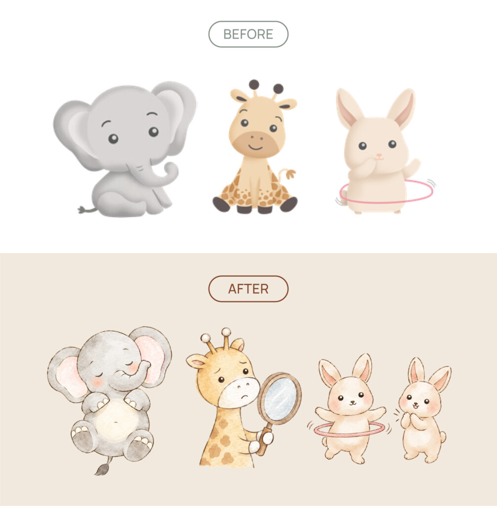
Its positioning as a “Cute Animal Baby Brand” was reflected in its colorful logo, Japanese characters, and playful, childlike illustrations.
However, customer insights revealed an opportunity to evolve beyond cuteness. Sumimo’s largest customer segment consisted of urban mothers who were accustomed to shopping online. When choosing products for their little ones, they prioritized function and comfort before appearance. Cuteness remained appealing, but it was not the primary reason behind their purchasing decisions.
This insight led to a strategic shift, from “Cute Animal Baby Brand” to “Baby Everyday Comforts”.
The challenge was to translate this new positioning into a brand identity that communicated comfort, quality, and trust while retaining Sumimo’s warmth and playful character.
Translating the New Positioning into Visual Identity
With “Everyday Comforts for Little Ones” as its new positioning, Stellaris1 developed a visual identity rooted in three core brand values; Comfort, Trust, and Compassion.
The logo was redesigned with a cleaner, more mature appearance, replacing its previous colorful treatment and Japanese characters with a simpler wordmark.
Illustrations also evolved into soft watercolor characters with organic strokes and gentle expressions. Complementing these elements, photography highlights natural moments, product textures, and everyday use through warm lighting and minimal styling.
Together, these elements create a visual language that puts comfort first without losing Sumimo’s approachable personality.
The Implementation
Bringing the Identity to Social Media and Marketplace
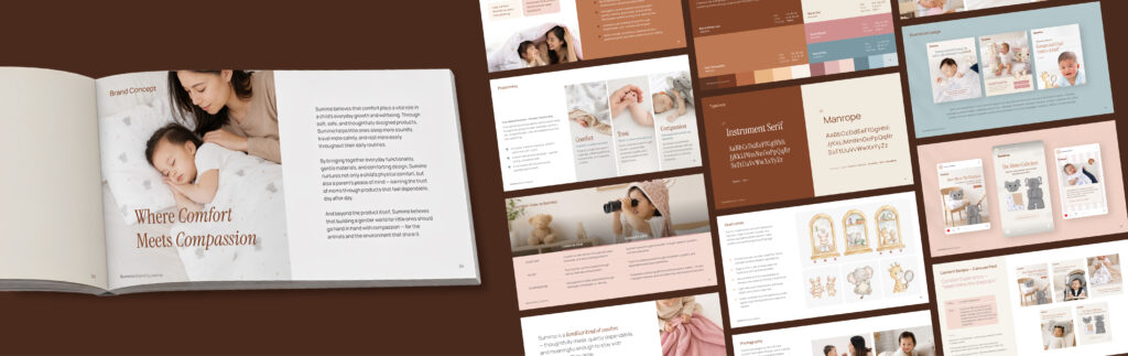
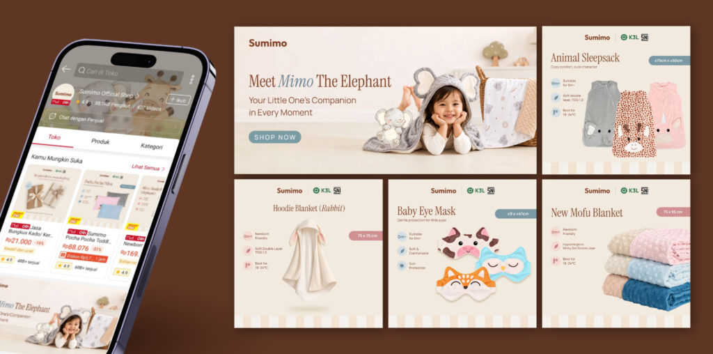
Stellaris1 then translated the new brand direction into guidelines for Sumimo’s social media and marketplace channels.
On social media, the focus was to build a more cohesive brand presence through consistent visuals and communication that highlight everyday comfort, product quality, and the emotional connection with modern parents.
On the marketplace, the focus was on making product information clearer through a consistent presentation structure, covering product images, real-life usage, available variants, and packaging.
The result is a more coherent brand experience, from discovering Sumimo on social media to exploring its products on the marketplace.
A More Thoughtful Expression of Sumimo
The transformation of Sumimo was never about making the brand less cute. It was about understanding what matters more to the people choosing its products.
By translating customer insights into a clearer brand positioning, a more mature visual identity, and practical channel guidelines, Stellaris1 helped Sumimo build an expression that goes beyond appearance.

